Transforming an Outdated Digital Experience

In early 2020, the U.S. Department of Education launched a design challenge seeking creative redesigns for ED.gov, their primary public-facing website serving 15 million annual users including students, parents, educators, and policy officials.
Our team at IDSI submitted a prototype redesign addressing the site's core challenges: difficult navigation, outdated functionality, text-heavy pages, and lack of mobile responsiveness.
My role focused on designing the Homepage, Grants, Program Offices, and a selected Program Office page.

Ed.gov during Spring 2020
ED.gov hadn't undergone a major redesign since 2015, and the site struggled with fundamental usability issues:
To understand the navigation problems, our team conducted a comprehensive sitemap audit, mapping every link across the existing ED.gov site.
Key findings:
13 dead links leading to error pages
Numerous duplicate pages with identical or overlapping content
Confusing hierarchy that buried high-priority content (loans, grants, compliance info)
This revealed that the navigation structure itself was broken, not just poorly designed. Any redesign would need to fundamentally reorganize how content was structured and accessed.

Sitemap created with Coggle
We also analyzed state and federal government websites to identify best practices for information architecture, accessibility, and responsive design.
1) Simplified Navigation Structure
The sitemap audit showed users were navigating through dead ends and duplicate content. We reorganized the site architecture to eliminate redundant pages and create clear pathways to high-priority content.
The solution: Consolidated navigation focused on user intent (e.g., "Apply for federal student aid" rather than nested bureaucratic categories). Removed dead links and merged duplicate pages into single, authoritative sources.
This made it easier for users to find what they needed without hunting through broken or redundant pages.
2) Visual Hierarchy and Accessibility
The challenge required Section 508 compliance, but the existing site was overwhelmingly text-heavy with poor scannability.
The solution: Introduced clear visual hierarchy using icons, imagery, and strategic whitespace to break up dense content. Integrated UserWay accessibility widget to support contrast adjustments, text resizing, and screen reader compatibility.
This made the site both more scannable for all users and compliant with federal accessibility standards.
3) Responsive Grid System for Mobile and Tablet
ED.gov had never been optimized for mobile or tablet, despite serving millions of users across devices.
The solution: Designed a flexible grid system that adapted content hierarchy across breakpoints. Navigation simplified to essential links on mobile, with content reorganizing to maintain readability on smaller screens.
For the first time, users could access ED.gov on any device without losing functionality or legibility.
The final prototype redesigned four key page templates:
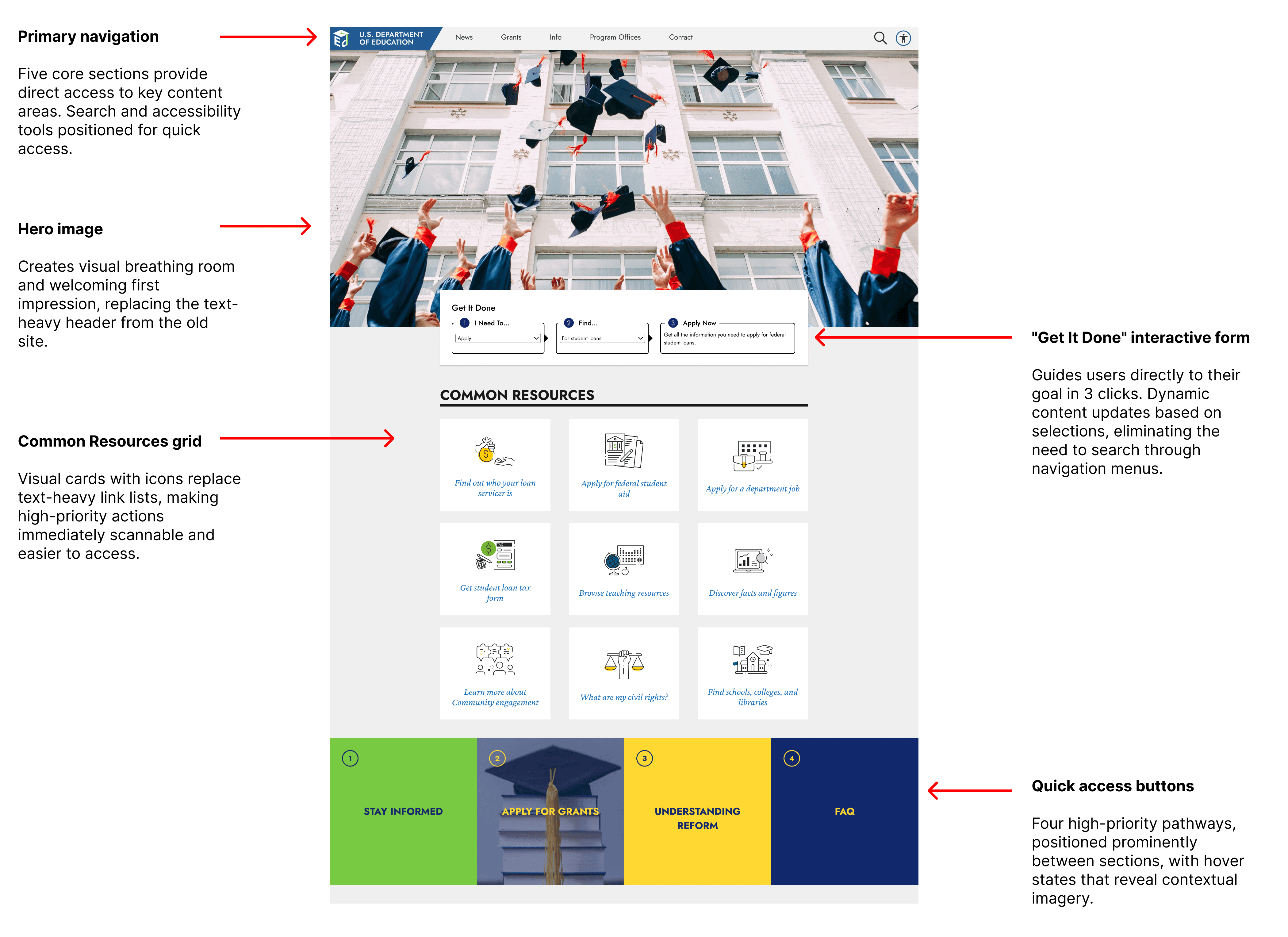
Homepage: Streamlined navigation with clear pathways to top user goals (financial aid, grants, compliance). Visual cards replaced text-heavy lists.

Home page
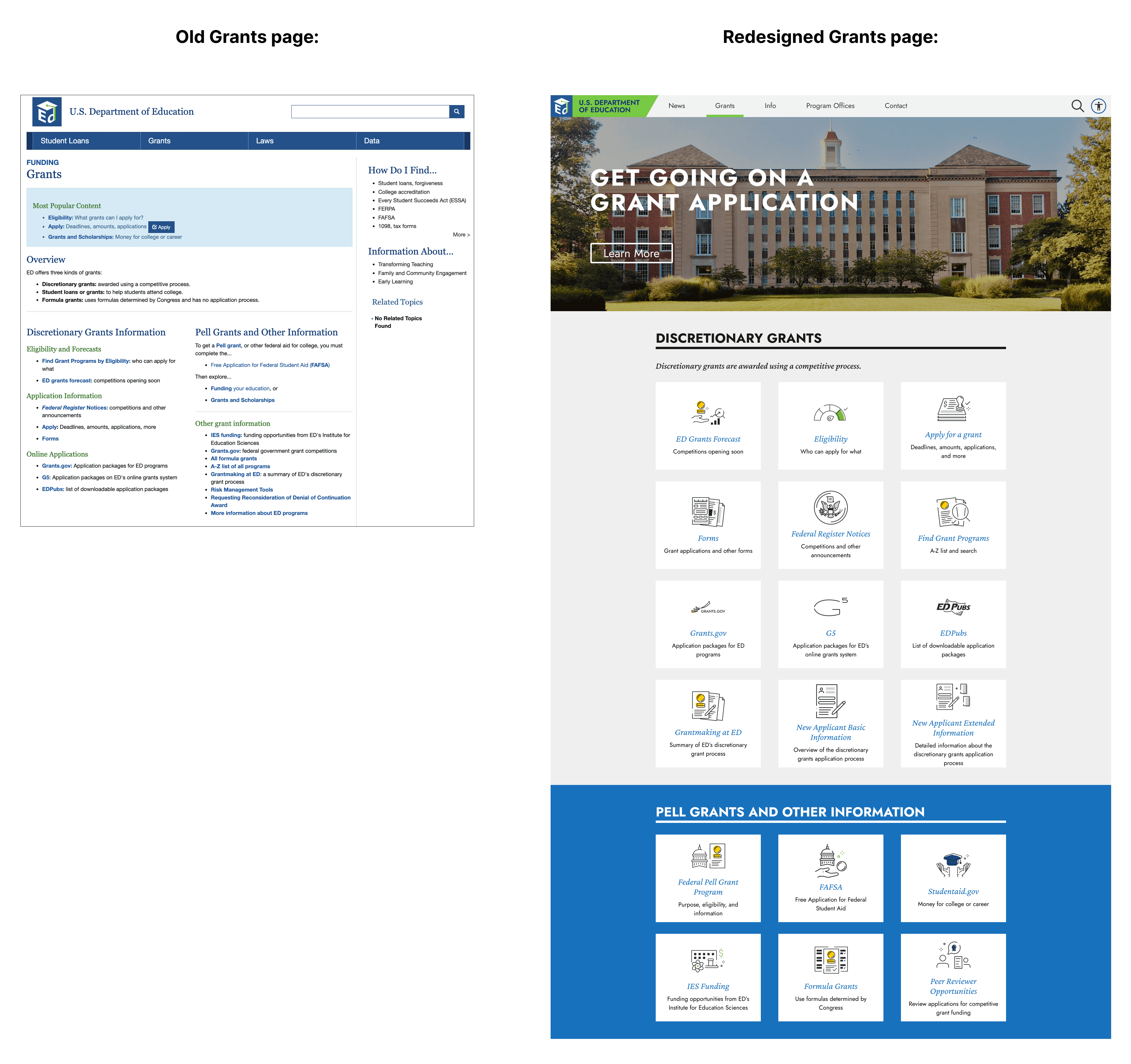
Grants Page: Simplified grant discovery with distinguished categories and visual emphasis on application deadlines.

Grants page
Program Offices: Reorganized office listings with icons and descriptions, making it easier to identify relevant departments.

Program Offices page
Selected Program Office: Template for individual office pages with consistent layout, contact info, and resources.

A selected Program Office page:
Office of the Secretary and Deputy Secretary
Video: Desktop version of ED.gov redesign
While our proposal was not selected, the challenge prototypes informed the Department's future requirements for ED.gov's rebuild.
The project reinforced the importance of starting with information architecture before visual design - the sitemap audit revealed that navigation problems stemmed from broken structure, not just poor UI.
This approach to research-first problem-solving continues to shape how I approach complex content-heavy redesigns.